I’m Aswathi. Product Designer turning complex ideas into simple, intuitive experiences.

85%

Improved design consistency

80%

Stronger component reusability

80%

Enhanced visual hierarchy

75%

Improved attention to detail

Symbol Details - FYERS

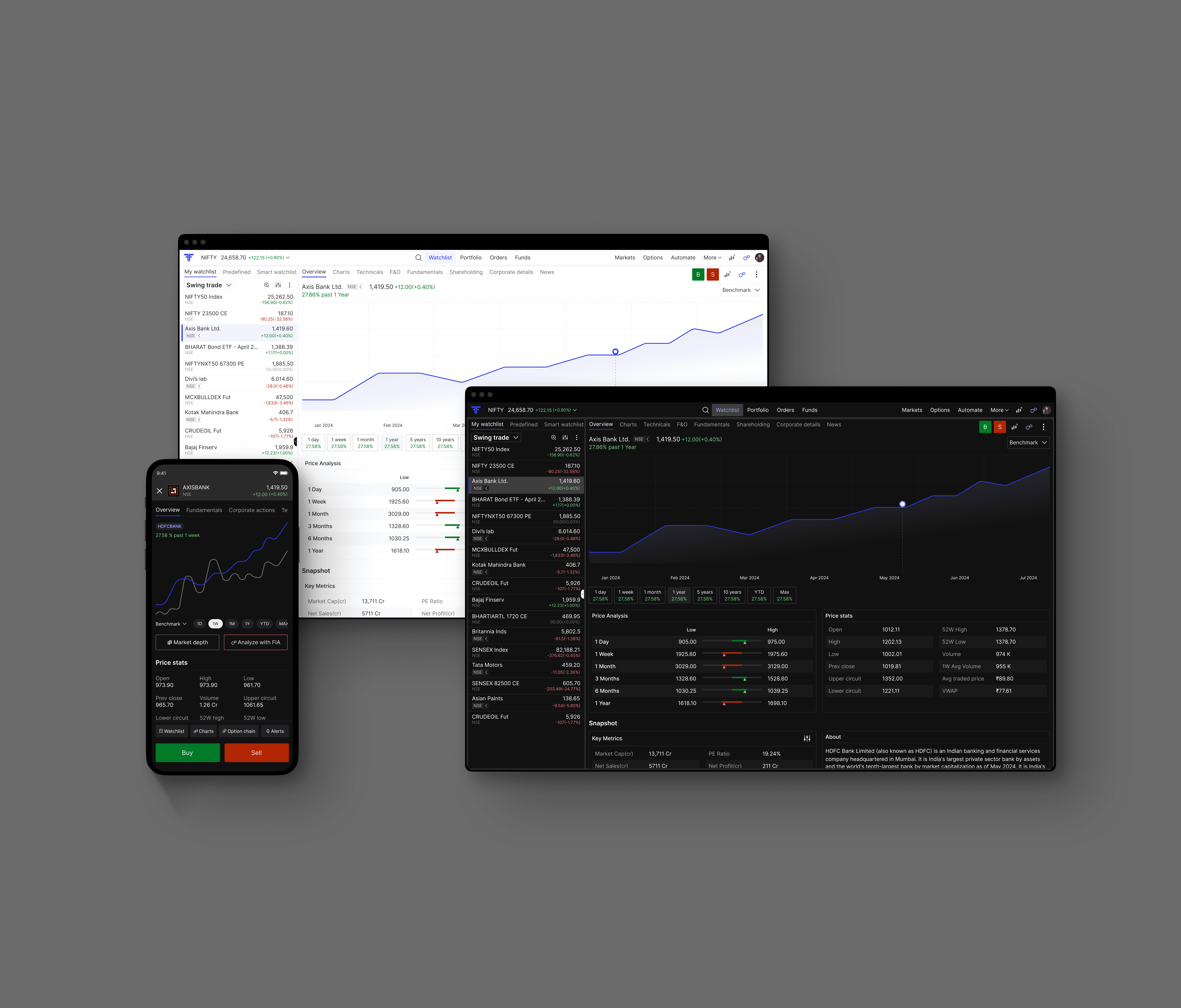
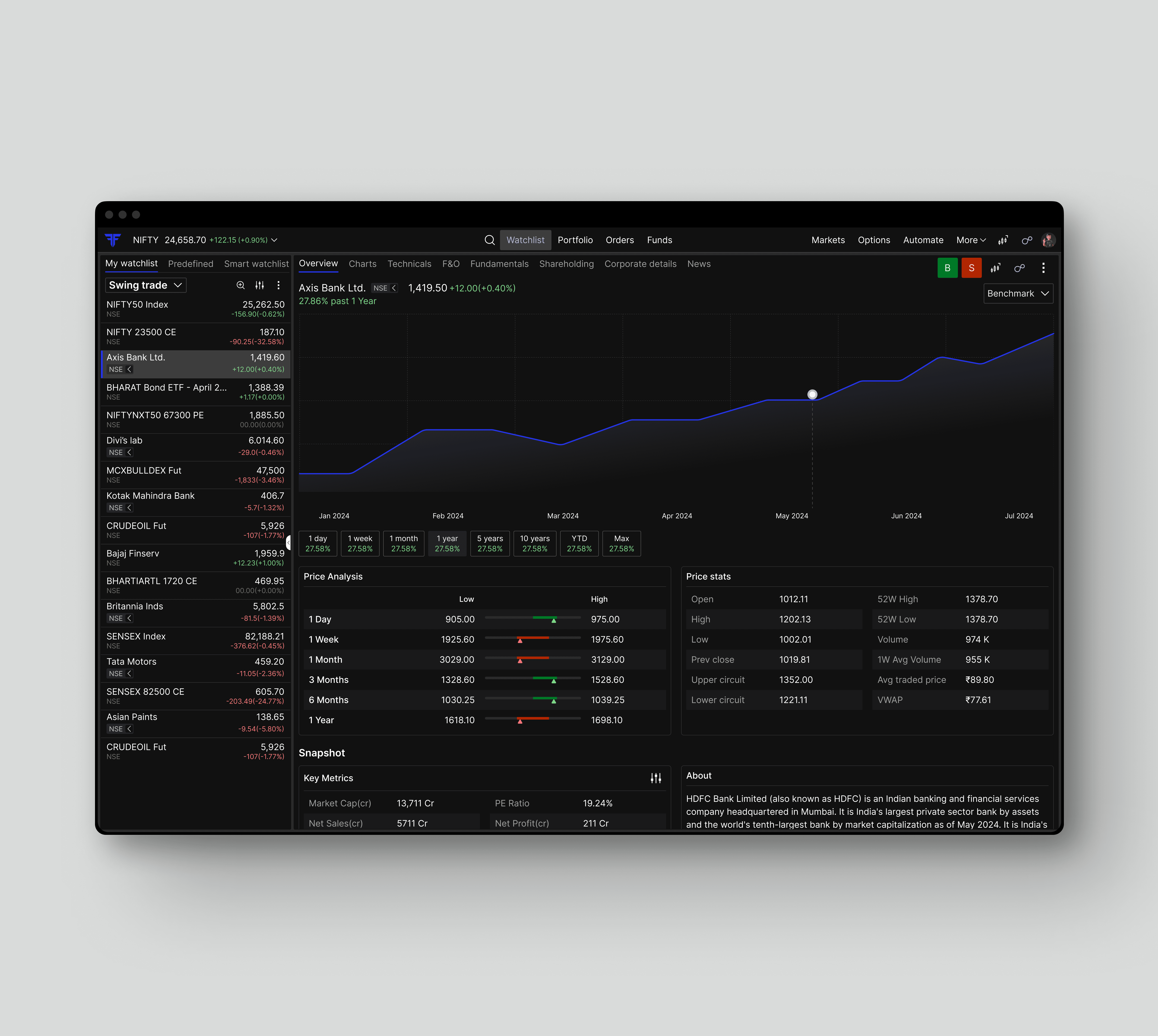
The symbol details interface is designed to seamlessly combine UI clarity with UX efficiency, presenting real-time pricing, market depth, and key metrics in a structured, easy-to-navigate layout for informed trading decisions across both web and mobile interfaces.

Tablet showing Bloomy UI

ROLE

Product Designer II

PROBLEM

The lack of a clear, actionable view of symbol data makes it difficult for investors to identify opportunities. A unified approach can transform complex data into meaningful insights for smarter decisions.

RESULTS

40% increase in active weekly users within 3 months

Reduction in average task time by 35% for key workflows

Consistent 4/5 user satisfaction score in post-launch feedback

Understanding the Pain Points

Traders and investors often rely on multiple sources to gather symbol-related information, from price movements to market depth and key financial metrics. In a fast-moving trading environment, this fragmented approach makes it difficult to form a clear, actionable understanding at the right moment. The lack of structure, consistency, and clarity not only slows down decision-making but also increases the chances of missing critical opportunities. Understanding these challenges was key to identifying where users face the most friction and how the experience could be reimagined to better support timely, confident decisions.

Laptop showing Bloomy UI
Tablet showing Bloomy UI
Laptop showing Bloomy UI

Redesigning with Intent

Initial analysis focused on understanding how traders consumed stock information across different stages of their journey—from quick market scans to in-depth research before placing a trade. The primary usability challenges identified were:

1. Overloaded interface with too much information competing for
attention.
2. Lack of clear visual hierarchy between critical and secondary data.
3. Frequent switching between tabs to access different insights.
4. Difficulty comparing price performance across multiple timeframes.
5. Poor discoverability of important fundamentals and market statistics.

Early exploration focused on simplifying information consumption without compromising the depth of data required by active traders. Multiple design directions were explored:

  1. Card-based layouts to improve information grouping.

  2. Different approaches to presenting charts alongside key metrics.

  3. Progressive disclosure to surface essential insights first while keeping detailed information accessible.

  4. Multiple navigation models including tabs, collapsible sections, and sticky navigation.

  5. Alternative layouts for balancing technical analysis, company fundamentals, and trading actions.

The redesigned experience introduced:

  1. A prominent interactive price chart as the primary visual anchor of the page.

  2. Timeframe selectors for quick historical performance comparison.

  3. Dedicated cards for Price Statistics, Price Analysis, and Key Metrics, improving information scannability.

  4. A modular layout that grouped related information into meaningful sections instead of long data tables.

  5. Clear visual hierarchy using typography, spacing, and colour to prioritise decision-critical information.

  6. Persistent Buy and Sell actions positioned close to relevant market information.

  7. Consistent layouts and interaction patterns across desktop and mobile experiences.

The designs were iteratively refined through multiple rounds of feedback and usability reviews:

  1. Improved scanning efficiency through structured content blocks and better spacing.

  2. Increased discoverability of key company information without requiring excessive scrolling.

  3. Simplified navigation between technical, fundamental, and historical data.

  4. Created a scalable design framework capable of supporting future modules.

Phone showing Bloomy UI
Tablet showing Bloomy UI
Laptop showing Bloomy UI

In Conclusion

The symbol details redesign wasn’t just about visual clarity—it was about enabling traders or investors to make faster, more confident decisions. By addressing real pain points, simplifying complex data, and designing with intent, the experience was transformed into one that feels intuitive and efficient. The result is a more seamless interaction with market data, improving usability, decision speed, and overall user confidence. A thoughtfully crafted dark theme was also incorporated to enhance usability.