I’m Aswathi. Product Designer turning complex ideas into simple, intuitive experiences.

85%

Improved design consistency

80%

Stronger component reusability

80%

Enhanced visual hierarchy

75%

Improved attention to detail

Advanced Screeners - FYERS

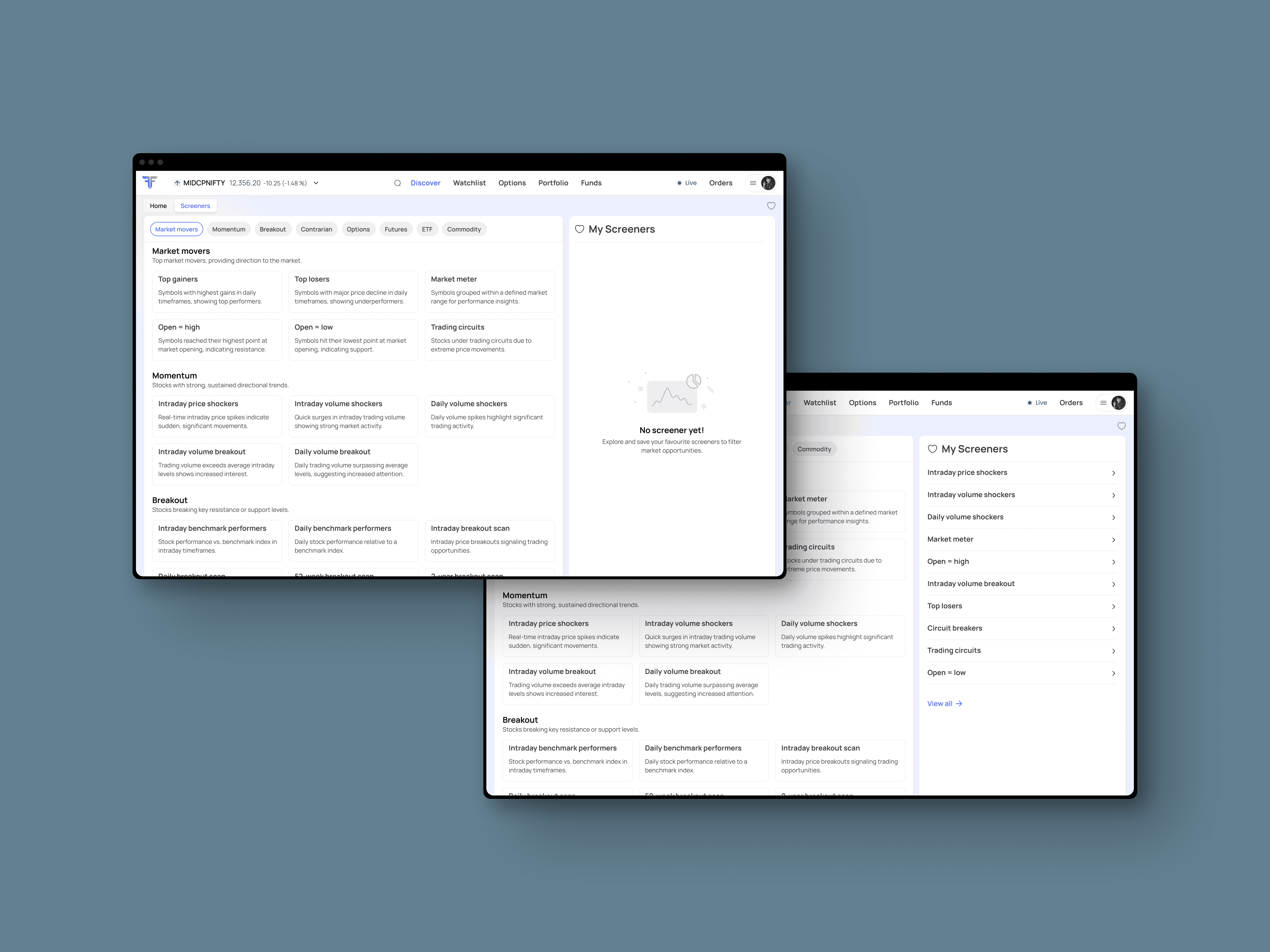
Designed an advanced screening experience that enables traders to filter and analyse stocks using customisable technical and fundamental criteria, making discovery faster and more efficient.

Laptop showing Bloomy UI

ROLE

Product Designer I

PROBLEM

  • Users face difficulty in discovering relevant stocks quickly, as data is spread across multiple sources and screening tools lack flexibility.

  • The screening experience is often cumbersome, with fragmented data and limited control over filtering logic.

RESULTS

↑ 3.5x increase in engagement time

↓ Reduced friction in building and refining screeners

↑ Higher interaction depth across filters and results

↑ Improved user confidence in decision-making

Optimising Stock Discovery Through Intelligent Screening

Stock discovery is a critical yet often inefficient step in a trader’s workflow. Users are required to navigate scattered data, interpret multiple indicators, and rely on rigid screening tools that limit flexibility. This results in slower decision-making, increased cognitive load, and missed opportunities.

This project focuses on reimagining the advanced screening experience to make stock discovery faster, more intuitive, and insight-driven. The goal was to simplify how users interact with complex financial data by introducing a flexible, scalable filtering system that supports both technical and fundamental analysis.

The redesigned experience enables users to seamlessly build, refine, and iterate on multi-condition screening strategies through a structured and intuitive interface. By prioritizing clarity, progressive disclosure, and real-time feedback, the solution reduces friction in the screening process while improving discoverability and engagement.

By transforming a traditionally complex workflow into a streamlined and user-centric experience, the project aims to empower traders to uncover relevant opportunities efficiently and make more confident, data-driven decisions.

Tablet showing Bloomy UI

From Problem to Solution

The project began with identifying key friction points in the existing screening experience. Traders struggled with scattered data, rigid filtering systems, and a lack of flexibility in building meaningful screening strategies. The workflow was fragmented, making stock discovery time-consuming and cognitively demanding.

Initial analysis focused on evaluating the current screener experience and identifying usability gaps. Key issues included

  1. Complex and non-intuitive filter setup

  2. Limited flexibility in combining multiple conditions

  3. Poor visibility of applied filters and results

  4. High drop-offs during the screening process


Early brainstorming explored ways to simplify the interaction model while maintaining the power of advanced screening. Multiple directions were considered:

  1. Modular filter components for flexibility

  2. Step-by-step vs. single-view filter building

  3. Visual hierarchy to prioritise key data points


The final approach centered around creating a structured yet flexible screening system:

  1. Introduced an intuitive filter builder to combine technical and fundamental criteria

  2. Enabled quick addition, removal, and modification of conditions

  3. Applied Step-by-step filtering

  4. Designed a clean layout with clear hierarchy for better scalability


The designs were iteratively refined based on usability considerations:

  1. Reduced the number of steps required to create and edit screeners

  2. Improved clarity of applied filters and their impact on results

  3. Enhanced interaction feedback to guide users through the workflow


The redesigned advanced screener replaced the existing experience on Web, introducing a streamlined interaction model and a more intuitive interface. This significantly improved usability and reduced friction in the screening process.

Post-launch, the platform saw a strong increase in engagement, with average session duration rising from 1:05 minutes to 3:50 minutes, indicating deeper interaction, improved discoverability, and higher user confidence in building and using screening strategies.

Laptop showing Bloomy UI
Devices showing Bloomy UI
Laptop showing Bloomy UI

Impact & Learnings

The redesigned screening experience improved usability and increased user engagement by simplifying complex workflows. With a focus on clarity, flexibility, and real-time feedback, it made navigating data easier and more intuitive.

This project highlights the importance of reducing cognitive load and designing for progressive interaction in data-heavy environments where speed and accuracy matter.