FYERS Design System
Designed and scaled a comprehensive design system to improve consistency, efficiency, and collaboration across FYERS products, supporting both dark and light themes across mobile, desktop, and widescreen platforms.
ROLE
PROBLEM
The Challenge
As FYERS expanded, inconsistencies emerged across components, layouts, typography, colors, and interaction patterns. This resulted in fragmented user experiences and inefficiencies in design and development workflows. The challenge was to create a scalable design system that ensured consistency, accessibility, and faster product delivery.
Project Goals
The goal was to establish a scalable and maintainable design system that would:
- Create a single source of truth for design decisions
- Improve visual and interaction consistency
- Reduce duplicate design and development efforts
- Accelerate design-to-development workflows
- Build reusable and scalable components
- Strengthen designer-developer collaboration
Audit & Discovery
A comprehensive audit was conducted across products to identify inconsistencies and recurring patterns. The review uncovered variations in components, typography, spacing, colors, forms, and navigation, highlighting opportunities for standardization. Key findings:
-Multiple versions of similar components existed across products
- Typography and spacing patterns lacked consistency
- Colors were being used inconsistently
- Design decisions were not centrally documented
- Repeated effort was spent recreating existing UI patterns
Establishing the Foundations
To create a scalable system, foundational design principles were defined across color, typography, spacing, elevation, border radius, and iconography. These standards established a consistent visual language while ensuring accessibility, readability, and long-term scalability.
RESULTS
70–80% reduction in design inconsistencies
70–80% increase in component reuse
50–60% faster design-to-development handoff
100% adoption of foundational design standards
Color System
The color system was designed to create visual consistency while supporting accessibility and usability requirements.
Colors were organized into semantic categories such as primary, secondary, success, warning, error, and informational states. Clear usage guidelines were established to ensure consistent application across products and use cases.


Typography, Spacing & Layout
Typography
Typography plays a critical role in creating hierarchy and readability. A structured type scale was introduced to define headings, body text, labels, captions, and supporting content.
Consistent font sizes, weights, and line heights helped create a predictable reading experience while ensuring clarity across different screen sizes and contexts.
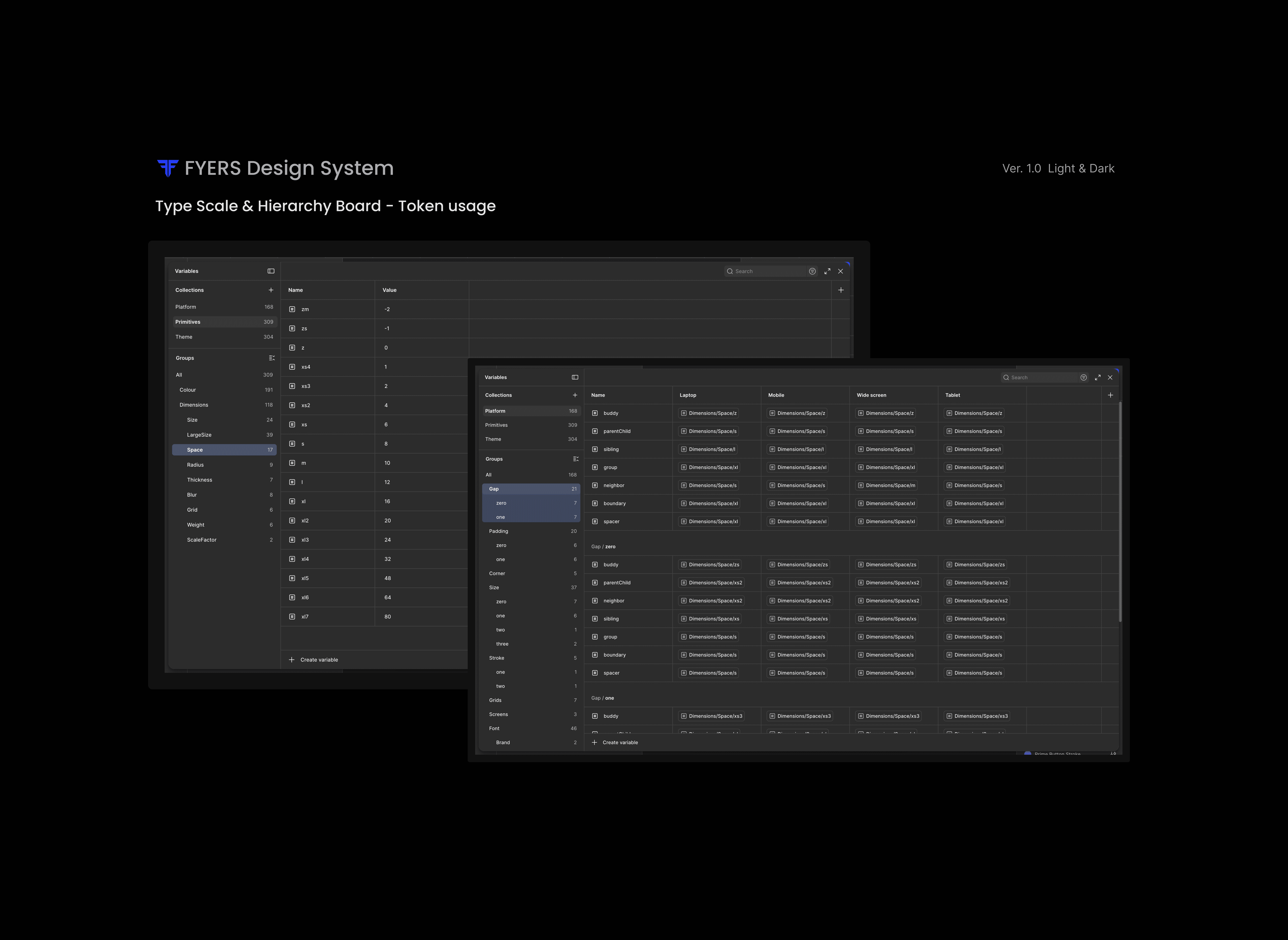
Spacing & Layout
To create alignment and visual rhythm, a standardised spacing framework was introduced using a consistent grid and spacing scale.


Impact & Outcomes
The design system established a scalable foundation that improved consistency, efficiency, and collaboration across products.
Key outcomes
~70 - 80% reduction in design inconsistencies
Through standardized foundations and reusable components.
~70 - 80% increase in component reuse
Reducing duplication and promoting consistency.
~50 - 60% faster design-to-development handoff
Enabled by comprehensive documentation and shared standards.
A scalable foundation for future growth
Supporting product expansion while maintaining consistency.
Key Learnings
Building a design system goes beyond creating UI components. It requires understanding how teams work, how products evolve, and how design decisions scale over time.
This project strengthened my understanding of systems thinking, component architecture, documentation, and cross-functional collaboration. It also reinforced the importance of balancing consistency with flexibility to support diverse product needs.
Final reflection
The FYERS Design System transformed the way design decisions were created, documented, and implemented across products. More importantly, it established a scalable framework that empowered teams to build faster, collaborate more effectively, and deliver more consistent user experiences.